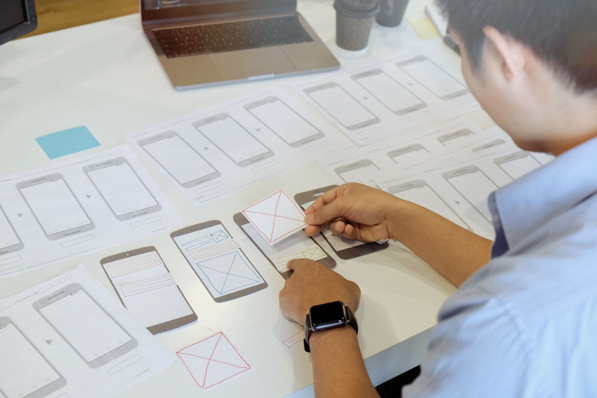
# Paper prototype
- Purpose
- Fast and cost-effective way to visualize the basic structure of an application
- Time required
- From 1 hour to 1 day
- Participants
- UX Conceptual Designer, UX Team
- Level of experience
- Beginner

# Summary
Paper prototypes are a very simple representation of a product concept or an interactive application. The idea is to deliberately work with the simplest means that are easy and cheap to change. They are a type of low-fidelity-Prototypes, usually the level of detail is low. To increase the realism, paper prototypes can also have a higher level of detail. By using several illustrations or superimposing them, interactions can also be represented. Thus, user tests can already be conducted with paper prototypes. However, the focus is not on testing functions, but rather on verifying the concept or idea.
# Result
A replica of the basic structure of the interactive application on paper, which is used for communication with the team and with users.
# Approach
- First of all, you have to choose which part of the interactive application you want to visualize.
- Then, the level of abstraction that makes the most sense for the prototype must be determined. Up to what level are the details of fundamental importance?
- Based on the usage requirements, a paper sketch should be created for each screen.
- Interactive elements can be drawn as small sections or on post-its.
- With this paper prototype, a user test can be performed.
- Document the results of the user test and use them in the further development process.
# Time of use
Paper prototypes are particularly suitable for the first prototype runs in the project, as they are limited to the elementary features of an application.
# Tools and Templates
- Paper, scissors, glue
# Advantages
Paper prototypes can be produced quickly and cost-effectively. This enables user tests to be carried out at an early stage of the project. Different variants can also be quickly created, discussed or evaluated. No technical knowledge or additional software is required. Like other visual methods, paper prototypes are usually easier to understand than a textual description of an interaction. They thus serve to generate a common basic understanding within the development team and can prevent comprehension problems.
# Disadvantages
The interaction is not realistic, no system reactions can be shown. A usability assessment is only possible to a limited extent.
# Hints
Make sure you remain as minimalist as possible and keep the prototype as abstract as possible. It is advisable to use thick pens in order to avoid drawing in too much detail.
# Sources
- Papierprototyp (German) (opens new window). Institut für Konstruktionstechnik: Technische Universität Braunschweig
- Snyder, C. (2003) Paper Prototyping: The Fast and Easy Way to Design and Refine User Interfaces (opens new window) San Francisco: Morgan Kaufmann Publishers
- Papier-Prototypen - Methodenkarte des Mittelstand 4.0-Kompetenzzentrum Usability (German) (opens new window)
- User Interface Sketching - Methodenkarte des Mittelstand 4.0-Kompetenzzentrum Usability (opens new window)